Walmart Spark Good
Context: Spark good is the non profit organizations portal where NPO can collect donations and users can choose and see their donations to different charities.
Problem
-> The portal was in the oblivion, without a design system implemented or visual hierarchy of elements
-> Verification process wasn’t clear for users and the website wasn’t giving enough information about what to expect in every step of the process.
-> Users were finding Spark Good interface intimidating and complicated to navigate.
-> Customer support was getting too many requests because the users couldn’t find important taxes information.
Goals
-> Implement Walmart’s design system in the Spark Good portal.
-> Increase user satisfaction in the verification process.
-> Reduce customer support contact.
-> Improve the portal navigability.
Results
-> The portal was in the oblivion, without a design system implemented or visual hierarchy of elements.
-> Reduced contact to support by increasing the visibility of a critical action for users.
-> Increased user satisfaction within the verification process by improving the communication in each step of the process.
Approach
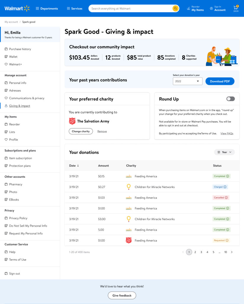
In the discovery phase, I had conversations with the stakeholders and accessed to users’ interviews where I found concerns about how difficult it was to find the information in the previous interface. Users were calling customer support to get access to their donations report needed to present their taxes, because they couldn’t find it in the website.
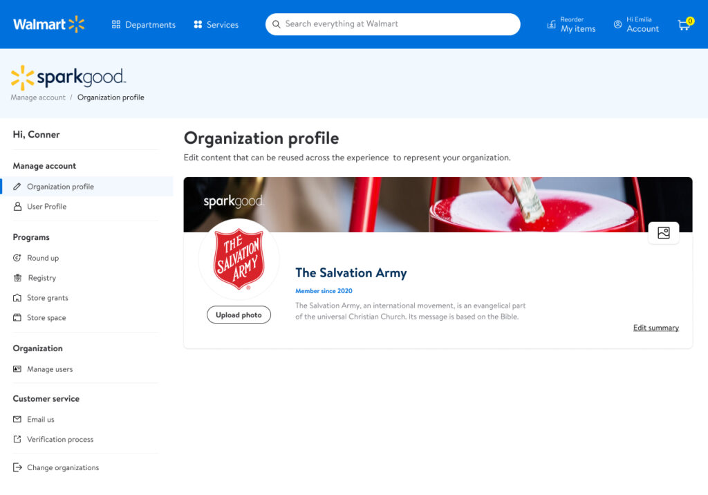
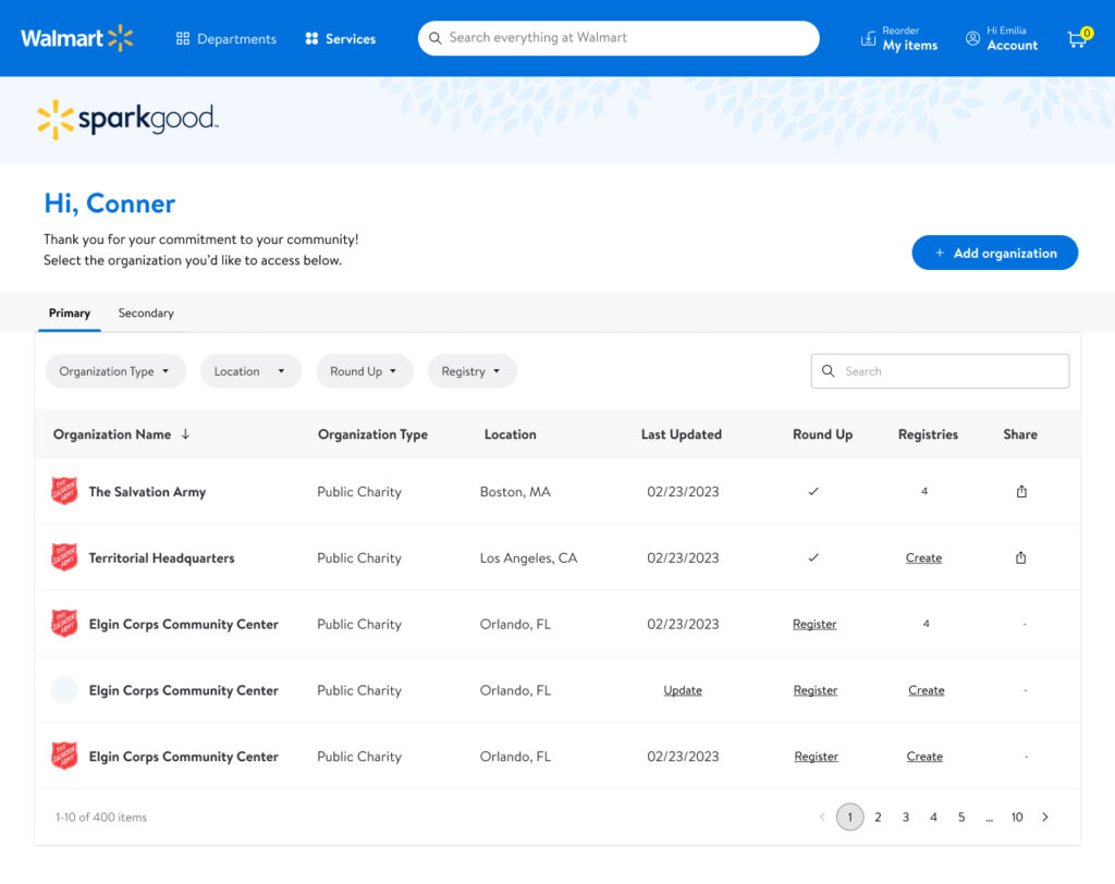
The first thing was to update all the interfaces with Walmart’s design system, contributing to it by adding new components that didn’t exist and were needed.
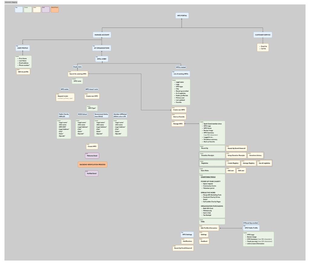
An UX audit was made to see where there was a lack of communication with the users, finding all the different gaps that needed to be filled with empty states that clearly communicate to the users the system status all the time (specially for charities verification process, which could take some days to be approved and the users where totally ‘blind’ without any information).
Another part of the process was to define the different content hierarchies, based on the user needs, highlighting the most important features so users could access them faster.
The proposed solutions were tested with regular users and charities administrators, getting satisfactory results in the interviews made after the changes were launched.