StudentUniverse Apps design
Context: There was an increase in the usage of mobile devices to search for flights, but mobile purchases were not growing at the same rate.
Problem
We identified that StudentUniverse users were using their phones only to search for flights, but they preferred to finalize their purchases on desktop devices.
Goal
Increase the number of purchases made from mobile devices.
Identifying pain points
I conducted user interviews to understand why users were not purchasing from their mobile devices. Alongside the interviews, we ran moderated usability tests where users completed various tasks to identify problem areas and made card sorting exercises to get a better idea of how to hierarchize the information.
These efforts provided valuable insights:
Pain point: The search flow that worked on desktop was excessively long and cumbersome on mobile devices.
Action: Redesign the search flow to reduce the number of steps.
Pain point: Users liked to verify their flight information multiple times before purchasing, but this information was difficult to access on mobile devices.
Action: Ensured that the necessary information was displayed at every step of the user journey.
Pain point: The checkout flow was too long on mobile devices, causing cognitive overload for users.
Action: Redesigned the checkout experience to make it more user-friendly and less intimidating.
Pain point: Users expressed frustration with finalizing purchases on mobile devices due to frequent loading screens interrupting the process.
Action: Worked with the development team to streamline the process by moving certain information to earlier stages. This reduced the number of loading screens and ensured users received valuable information during necessary waiting times.
Results
-> Mobile bookings: Before the app redesign, mobile bookings accounted for only 7% of total bookings. Eight months after the launch, mobile bookings represented over 30% of total bookings, exceeding expectations for the search-to-purchase ratio.
-> User feedback: Interviews revealed that users found it delightful to purchase via the app, and user satisfaction increased significantly due to the simplified booking process.
-> Task success rate: Achieved a 100% task success rate with the new app flow.
-> App Store ratings: Maintained a 4.9 ⭐️⭐️⭐️⭐️⭐️ rating.
Approach
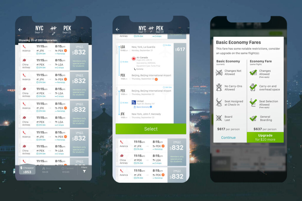
Redesigning the Search Flow
The search flow used on mobile devices was the same as on desktop, where users were accustomed to the pattern. However, on mobile, this caused a painful experience due to the back-and-forth navigation required before completing the form.
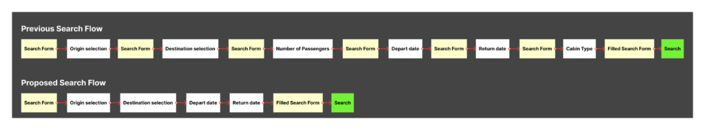
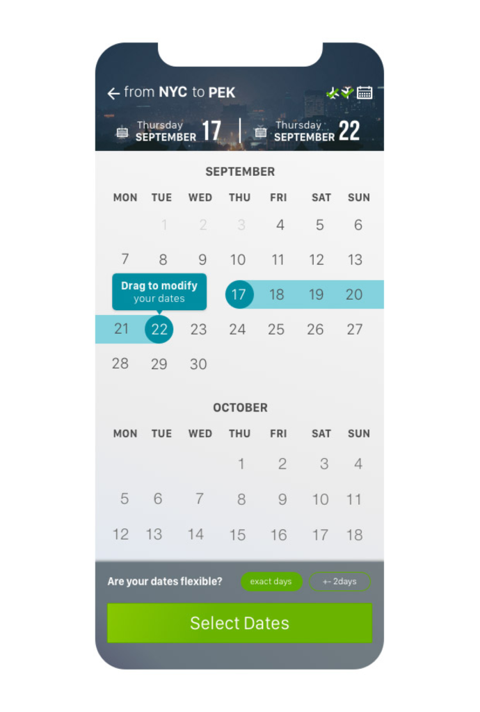
Solution: Redesigned the flow to show the form only at the beginning of the process and again at the end when it was completed, allowing users to confirm all the information before launching the search.
Reducing Perceived Waiting Time
Another proposal, not implemented, was to trigger the API call when the form was completed before users clicked “search.” Since 95% of users searched for one passenger in economy class, we already had enough information to pre-load results. However, this idea was rejected due to additional costs.
Instead, I proposed adding “travel tips” cards that users could swipe through to reduce their perception of waiting time.

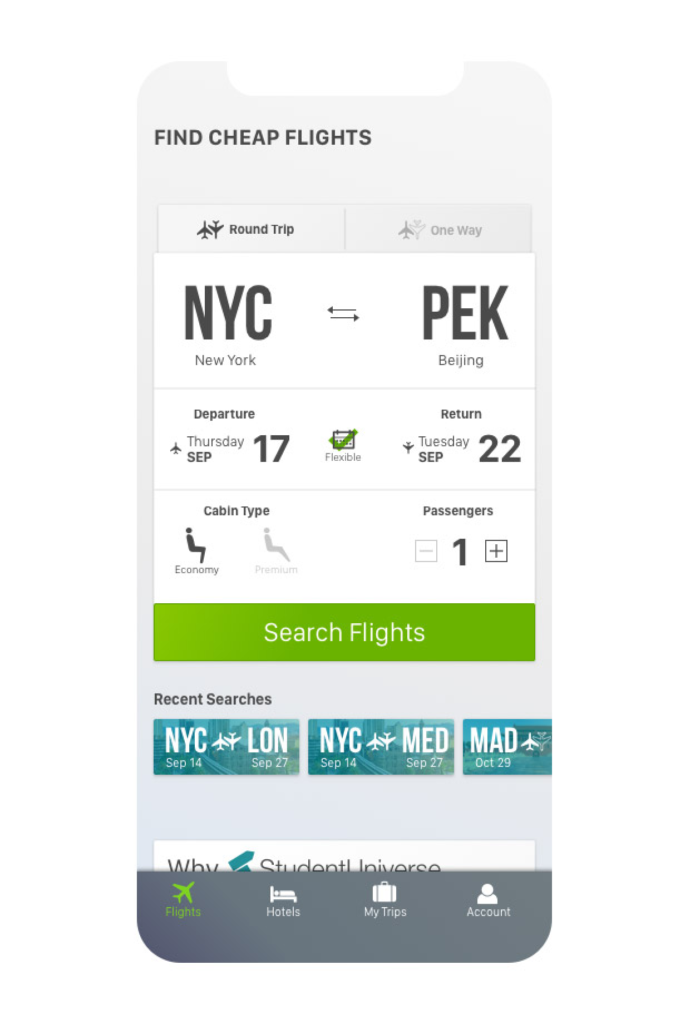
In the search screen we decided to add 2 different modules:
1 for recent searches, as the collected data showed us that users search for the same trip multiple times before purchasing, and a module explaining why they should book through our platform, to give them trust and confidence about getting the best available prices.
Collaborating with Developers to Improve the Flow
Initially, the API provided basic ticket information, but after selecting a ticket, users encountered an additional loading screen to retrieve full details.
Solution: I worked with developers to explore the possibility of retrieving all ticket details during the initial load. Although we discovered this would negatively impact loading times, we made a smaller adjustment that removed one loading screen, improving the overall user experience.
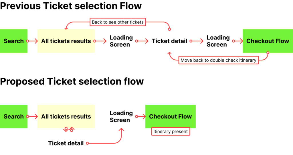
Improving the Checkout Flow
During the discovery phase, we found that flight information was missing during checkout. Users had to go back to previous screens to verify details, which often led them to switch to desktop to complete the purchase.
Solution: Added ticket details directly to the checkout flow and simplified the process. We removed the long form previously presented and replaced it with a step-by-step flow for traveler and payment information, allowing users to complete the purchase seamlessly.
While some proposed changes went against industry standards at the time, I used data from user testing to justify and support my design decisions.